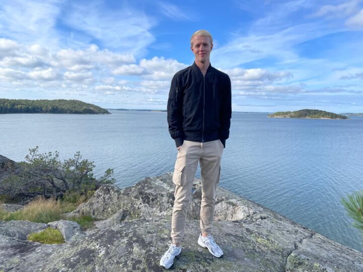
A PhD Student with 45000 Ways to Die
My PhD has taken me from translating historical causes of death to creating hundreds of maps exploring mortality across Finland and the environmental patterns that drive this mortality. Along the way, I’m exploring how human health was, has changed, and why those changes still matter today!
Data, data and more data
At the start of my PhD, I knew one thing, it will be heavy on the data. This initially excited me plenty but soon I came to realize the trials and tribulations of working with data of over 1.3 million Finns. The main goal of the first few months of my PhD was to figure out what data on health we have and how we are going to work with it. From historical church records of Finland, I was able to decipher for most of those 1.3 million individuals what was the reason they died way back in the 1800’s. I was definitely feeling great about being able to work with such a rare data source such as this but at the same time also dreading the fact that I had to interpret and sort over 45 000 unique causes of death. To complicate matters further these causes were written down in mostly Swedish or Finnish, neither of which I speak. Luckily Dutch is kind of similar to Swedish and with many google searches and colleagues advising me I’ve managed. It intrigued me how the priests who wrote down these causes got so creative with their abbreviations and ways of spelling the same death cause. For example, for “fever” I identified 166 ways of how a priest could write that down. A second hurdle was how to incorporate all of this information into my analysis. You can imagine that causes of death varied widely, from being kicked in the face by a horse, to smallpox, to tuberculosis, to deaths during childbirth. Detail also varied between entries, while some entries describe soap show tragedies like the crashing of 2 children through the ice on their way to church others will just state “cough”. Lucky for me recently this system emerged that is specifically designed for coding and categorizing historical causes of death based on the ICD10 system used for contemporary disease classifications. Through especially The Greatleap project I’ve been able to meet the people who are at the forefront of setting up this system and many peers who are using it to classify and categorize their data as well. Especially, Sara Luostarinen from the University of Helsinki has been a big help in this providing me with the basis to get the coding going. So, after a few months of translating, interpreting, coding, and classifying I now have the data I need for my research. Also, a big shout out to the Genealogical Society of Finland for assembling and digitizing this HisKi data based on the endless church records of those times which would have surely taken me the entire duration of my PhD if not way more.
Health inequalities
Having now all this information I first have set out to explore how the causes of death were distributed across Finland to see if there are disparities in mortality in that time period. I understand that many people might be like “Haven’t these people been dead for 200 years? Why should we care?”. But mortality is something that hasn’t changed overnight and over the last 200 years human health has evolved. Lifespans have increased significantly, early life mortality decreased which was largely due to the reduction of infectious diseases but much of the scenario prior to all these changes remains unknown. These infectious diseases especially had a huge impact back in the day but could also affect human health even in contemporary times. To give an example, there is evidence that the genes that were protective against the black plague in history are now associated with higher risk of autoimmune disease! So, understanding how the mortality landscape was looking back in the day is not only important for our understanding of how human health has changed but also what effects the past might still have! And guess what? For many of the historical causes of death categories we find clear distinct spatial patterns. These patterns are now my next focus, I want to try to determine which factors explain them, especially focusing on the environmental factors, and if these patterns persist over time. Finland is a great country to examine disparities in health because of the division between the east and west and the fact that in contemporary times there are already many spatial disparities documented like for cardiovascular disease, inflammatory bowel disease, and diabetes. It’s also great to work in a team with other researchers focusing on this same or other health data! Together we are working to decipher how human health was in the past, how it changed, and what effects it has had on human populations in Finland.
So you like death?
That’s maybe a bit of an overstatement, but truly some of my friends here have wondered this same thing. I’m at least very interested in human health and how it has changed and which factors play a big role. To give a bit of background information about myself, in my bachelor I studied Biomedical sciences but after that I decided I wanted to also learn more about computational science and programming etc. This led me to do a masters in Modelling for the life sciences during which I learned a lot about programming, data management and modelling. For my second master project I ended up doing a project already using historical data focusing on child survival and siblings (which I recently published by the way :D). So, after my master you can imagine that, having enjoyed working with historical data and my continued interest in biomedical principles, this PhD was exactly the perfect combination I was looking for. It just so happens to be that researching human health in the past is often tied to mortality outcomes but that of course does not mean that it’s not a bit sad to read about the untimely endings of some of the individuals in the population! Especially because a large proportion of the mortality refers to early life deaths due to the common infectious diseases at the time, like the previously mentioned smallpox but also whooping cough, dysentery, and measles were common. Some of the causes of death also contain quite graphic information like one that described how a woman had murdered her soldier husband and was then beheaded and her body set on fire. Luckily stuff like that was, as you might expect, quite uncommon!
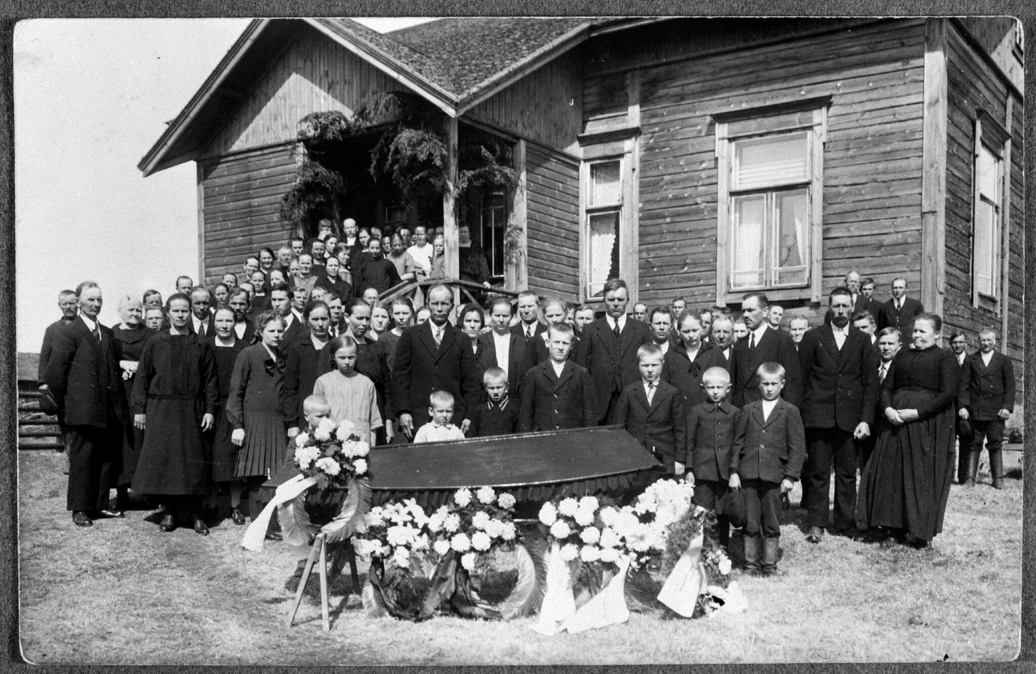
An early 1900’s Finnish Funeral (by the Finnish Heritage Agency Museovirasto from Kansatieteen kuvakokoelma)
The mappening
Part of looking at these inequalities was that I needed to map them. First of I started to create my own map which easier said than done. Using a historical photo of a map from the 1800’s division in Finland I manually had to create it. It was a lot of squinting and trying to figure out where the borders were of the districts I use in my analysis. At last, I ended up with an, in my opinion, gorgeous map in which I could map the frequencies of the different causes of death. Trust me I made good use of this map because I probably made over 1000 maps already. At some point I think I got the title of like the map guy cause every presentation or group meeting update I would be talking about maps. Making these maps brought me quite some joy though because it made visualizing my science just that much easier. Speaking of visualizing science…
Show don’t tell
During my PhD I’ve learned that I really am passionate about visuals especially when it comes to PowerPoint presentations. I’ve been very invested in making sure my PowerPoints are as clear and understandable as possible but at the same time aesthetically pleasing. This is probably in part due to having seen so many horrid presentations that I know what I don’t want to do to others but also because I really like being creative and thinking of ways how to show information that’s not just black text on a white background. It has gotten to the point where I’ll voluntarily take time out of my weekends or work for longer to spice up my presentations. Luckily, I also have a really invested and supportive office (Thank you GGG) that is always giving me feedback on the stuff I design. The real turning point came when my partner in crime when it comes to this Leticia Duarte introduced me to Inkscape, a program to do digital design and art perfect for this job. Since then, we’ve kind of developed this shared idea of how to make nice PowerPoints and even gave a workshop, called “Powerpointing in the right direction”, about it during the PhD Seminar and later for the international master students. I think science and communication is definitely something I’d like to pursue more in the future because whenever a poster, logo, presentation, or card has to be designed I’m delighted to do it.
The right choice
Looking back, if you had told me like 5 years ago that I would end up in Finland spending my days translating historical causes of death, making hundreds of maps, and voluntarily redesigning PowerPoint slides on the weekend, I probably would have called you crazy. Yet somehow it all fits together so well and my PhD so far has turned out to be a combination of everything I enjoy: data, programming, history, health, and a decent amount of creative problem solving. There are still many more questions left to answer and I’m sure many more struggles to overcome but I am overall excited to see where the next chapters of this project will lead. Hopefully I’ll uncover some of the remaining mysteries behind the patterns of death causes I’ve already found. I also quickly wanted to shout out the two amazing research groups, Lummaa Lab and Mirkka Lahdenperä’s group, in which I’ve been able to find my place and make so many new friends. Besides those groups one of the clear highlights of the PhD has been the countless friends I’ve been able to make from all across the world and enjoying our time here together in little Turku.
Follow Mark on LinkedIn and Bluesky (@markspa.bsky.social)!
 Co-funded by the European Union. Views and opinions expressed are however those of the author(s) only and do not necessarily reflect those of the European Union or European Research Executive Agency (REA). Neither the European Union nor REA can be held responsible for them.